Color and Presentation Tips for Creami
Why Presentation Matters
The difference between ice cream that looks homemade and ice cream that looks professional comes down to a few simple techniques. You do not need pastry school training or expensive equipment. You need an understanding of color, temperature, and timing.
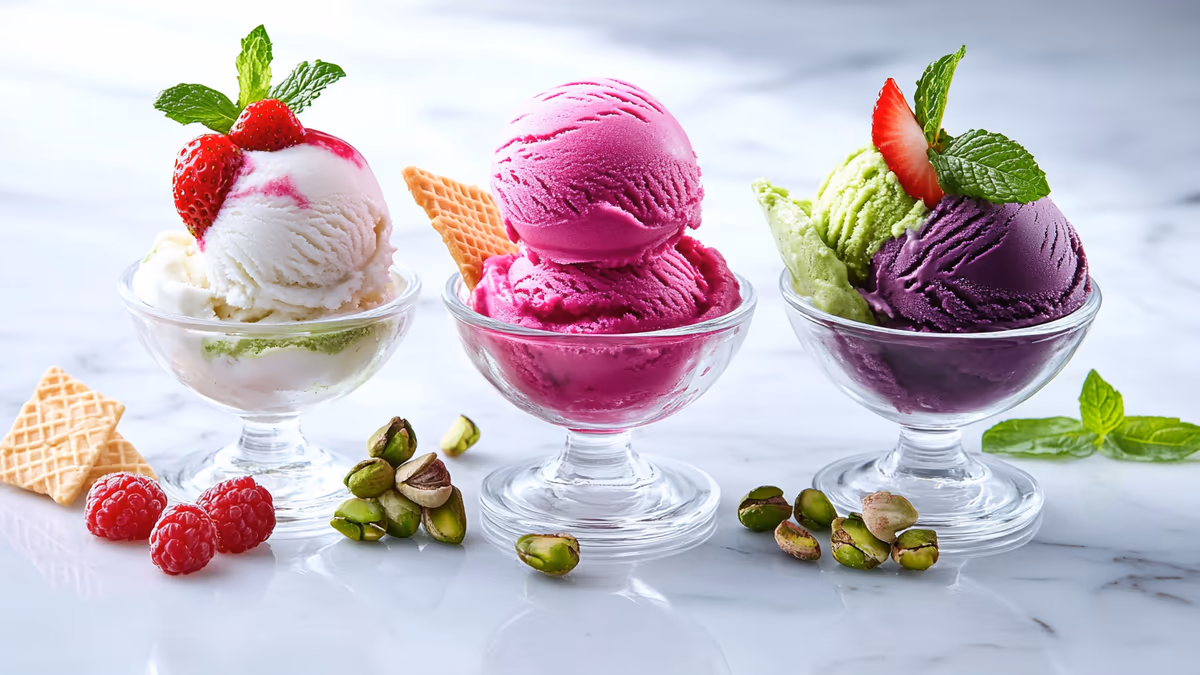
Ice cream is one of the most photogenic foods on the planet, and with the Ninja Creami you have the ability to make colors and textures that do not exist in stores. A vibrant pink strawberry swirl in a white vanilla base looks stunning. A deep purple acai sorbet in a clear glass is Instagram-ready. Even a simple vanilla bean with visible specks of vanilla looks more premium than anything from a carton.
The Creami community on social media is growing fast, and good presentation gets your creations noticed. Whether you are posting for fun, building a food blog, or just want to impress your family, these tips will make every pint look as good as it tastes.
Color Theory for Ice Cream
Natural Colors
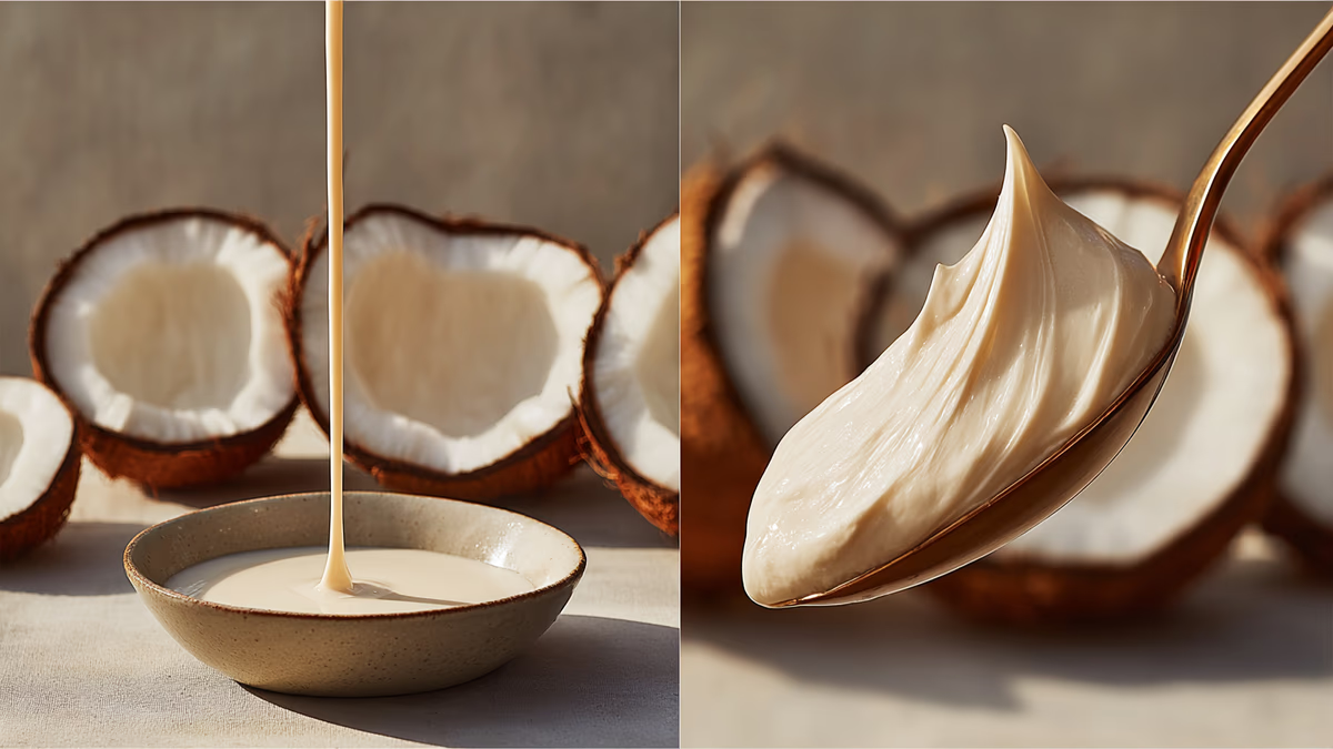
The best-looking ice cream uses natural color from real ingredients:
- Pink/Red: fresh strawberries, raspberries, beet powder (a tiny pinch adds color without flavor)
- Purple: blueberries, acai, blackberries, ube (purple yam)
- Green: matcha, pistachio, spinach (invisible in taste), avocado
- Yellow/Orange: mango, turmeric (a tiny pinch), pumpkin puree, passion fruit
- Brown tones: cocoa powder, espresso, brown sugar, peanut butter
Natural colors look more appetizing than artificial ones because they have depth and variation. A strawberry ice cream colored by real berries has beautiful pink variations throughout. One colored by food dye is flat and uniform.
Gel Food Coloring
When you need vivid colors that natural ingredients cannot achieve (like bright blue or neon green), use gel food coloring. Gel is better than liquid for ice cream because you need less of it (1-2 drops vs 10+ drops), so it does not affect the texture or flavor of your base. Always add coloring to the liquid base before freezing, not after processing.
Start with less than you think you need. Colors look more vivid in liquid form than they do once frozen and aerated. Add a drop, stir, evaluate, then add more if needed.
Serving and Plating
Temperature
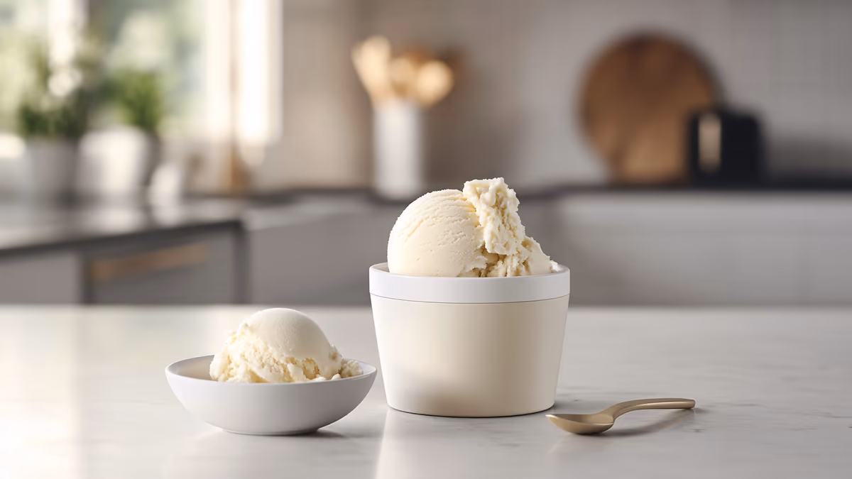
The single most important presentation factor is temperature. Ice cream that is too hard looks rough and craggy when scooped. Ice cream that is too soft melts and pools on the plate. The sweet spot is 3-5 minutes after processing, when the Creami ice cream is soft enough to scoop cleanly but firm enough to hold its shape.
For scoops, dip your scoop in warm water between each one. This creates smooth, round balls with clean edges. For gelato-style serving, use a flat spade and press-and-fold technique for those beautiful rustic waves.
Bowls and Glasses
The vessel matters more than most people realize. Clear glass bowls and coupes show off the color of the ice cream. White ceramic bowls provide a clean background that makes any color pop. Dark bowls (black, navy) create dramatic contrast for light-colored ice cream like vanilla or mint.
Avoid oversized bowls. A small portion in an elegant bowl looks more premium than a large portion in a cereal bowl. Champagne coupes work beautifully for sorbets. Mason jars create a fun, casual vibe for BBQ desserts.
Garnishes
The right garnish transforms good ice cream into great presentation:
- Fresh fruit: a few fresh berries, a slice of peach, or a wedge of lime add color and signal freshness
- Herbs: a small sprig of fresh mint is the single most effective garnish for almost any frozen dessert
- Crumble/crunch: crushed cookies, toasted nuts, or granola add textural contrast
- Drizzle: a thin line of chocolate sauce, caramel, or fruit coulis creates professional-looking streaks
- Powder: a light dusting of cocoa powder, matcha, or cinnamon through a fine sieve adds sophistication
- Edible flowers: available at specialty grocery stores, these are the ultimate Instagram garnish
The Three-Element Rule
Professional plating follows a simple rule: every plate has three visual elements. For ice cream, that means the ice cream itself, one contrasting garnish (like berries or cookie crumble), and one accent (like a drizzle or powder dusting). More than three elements looks cluttered. Fewer than three looks unfinished.
Photography Tips
- Natural light: shoot near a window. No flash, no overhead kitchen lights.
- Angle: 45 degrees from above captures both the scoop shape and the bowl. Directly overhead works for flat presentations like smoothie bowls.
- Speed: ice cream melts fast under lights. Have your camera ready before you plate.
- Background: a simple wooden cutting board, marble slab, or clean countertop works. Avoid busy tablecloths.
- Props: a spoon resting on the edge of the bowl, a napkin, or a few scattered ingredients add context without clutter.
Remember that the best presentation comes from confidence, not perfection. A slightly imperfect scoop with a beautiful garnish looks more inviting than a perfect scoop with nothing around it. Focus on color contrast, temperature control, and one thoughtful garnish, and your Creami creations will look as good as they taste.